Quickbooks
Back to WorkProject Details
UI/UX
When needing a solution to manage billing for my freelance clients, I turned to the industry standard accounting platform Quickbooks. After mistakenly signing up for the incorrect Quickbooks product multiple times, How did I made this mistake? I retraced the steps I took to identify the correct product for my usecase, and found I was more confused. I wondered if I was the only Quickbooks user to experience this, and after researching help forums, speaking to other quickbooks users and accountants it became evident to me that Quickbooks website had a user experience problem. After speaking with several customer support agents and getting a thorough understanding of their product offerings and target consumer, I felt Quickbooks sales landing page and main menu could benefit from a reorganization that more clearly differentiates their product offerings to customers.
Research
Quickbooks offers three separate base products. These three base product are entirely segmented and users cannot upgrade or downgrade between products
- - Money
- - Soloprenuer
- - Quickbooks Online
Each product offers different features and pricing plans. Quickbooks also offers add-on products/services to each base product such as virtual bookkeeping, payroll and tax preparation.
Although individual product data is segmented, they share a login system. Each user may signup for different products under a single account
Product Selection
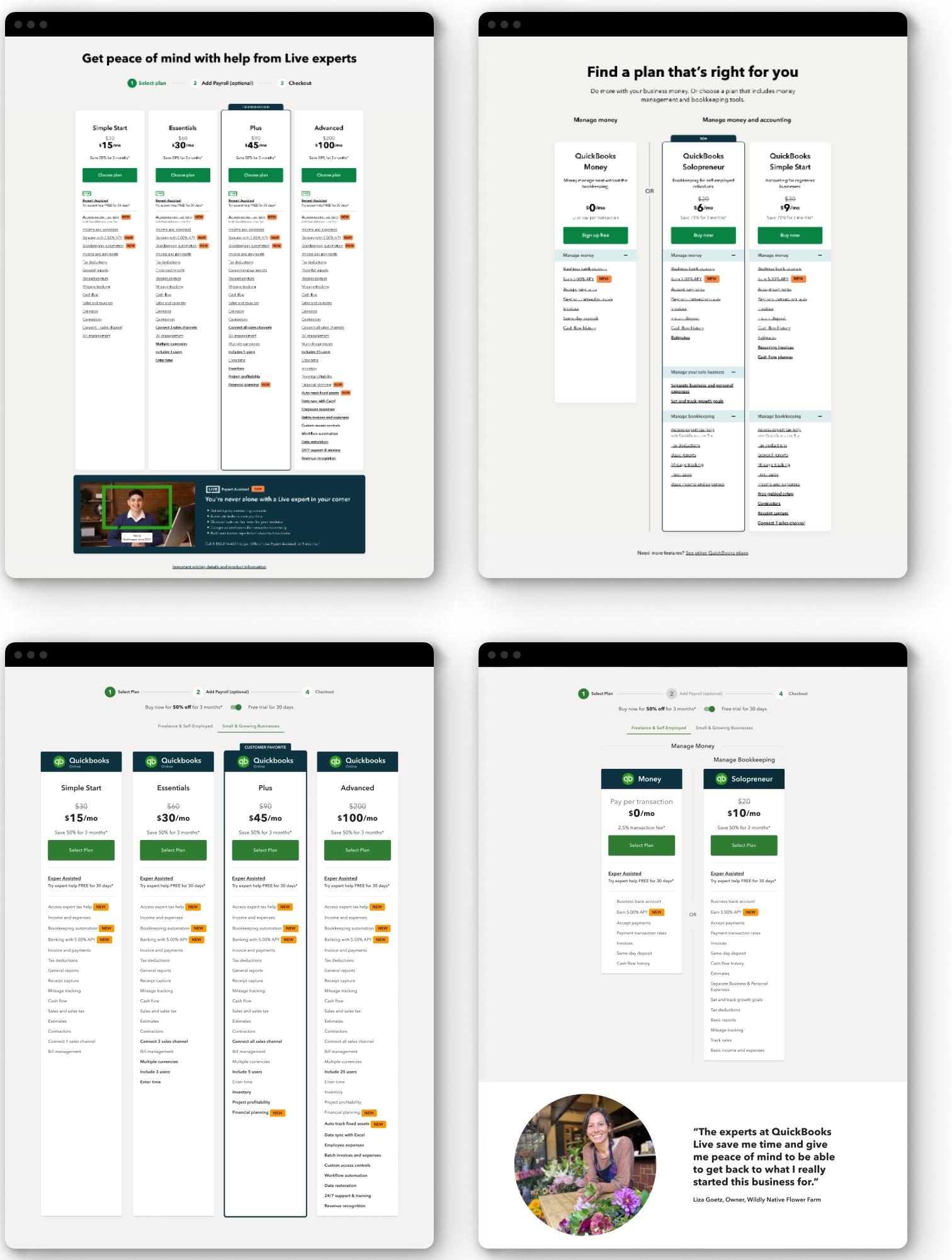
On the Quickbooks homepage, customers are presented only with subscription options for Quickbooks Online. The only way to discrover Quickbooks other products are through the main menu. Adding a simple toggle for business type, in the product selection section, allows potential customers to view all products and subscription options to select the correct product for their business use-case.

Dropdown Menu
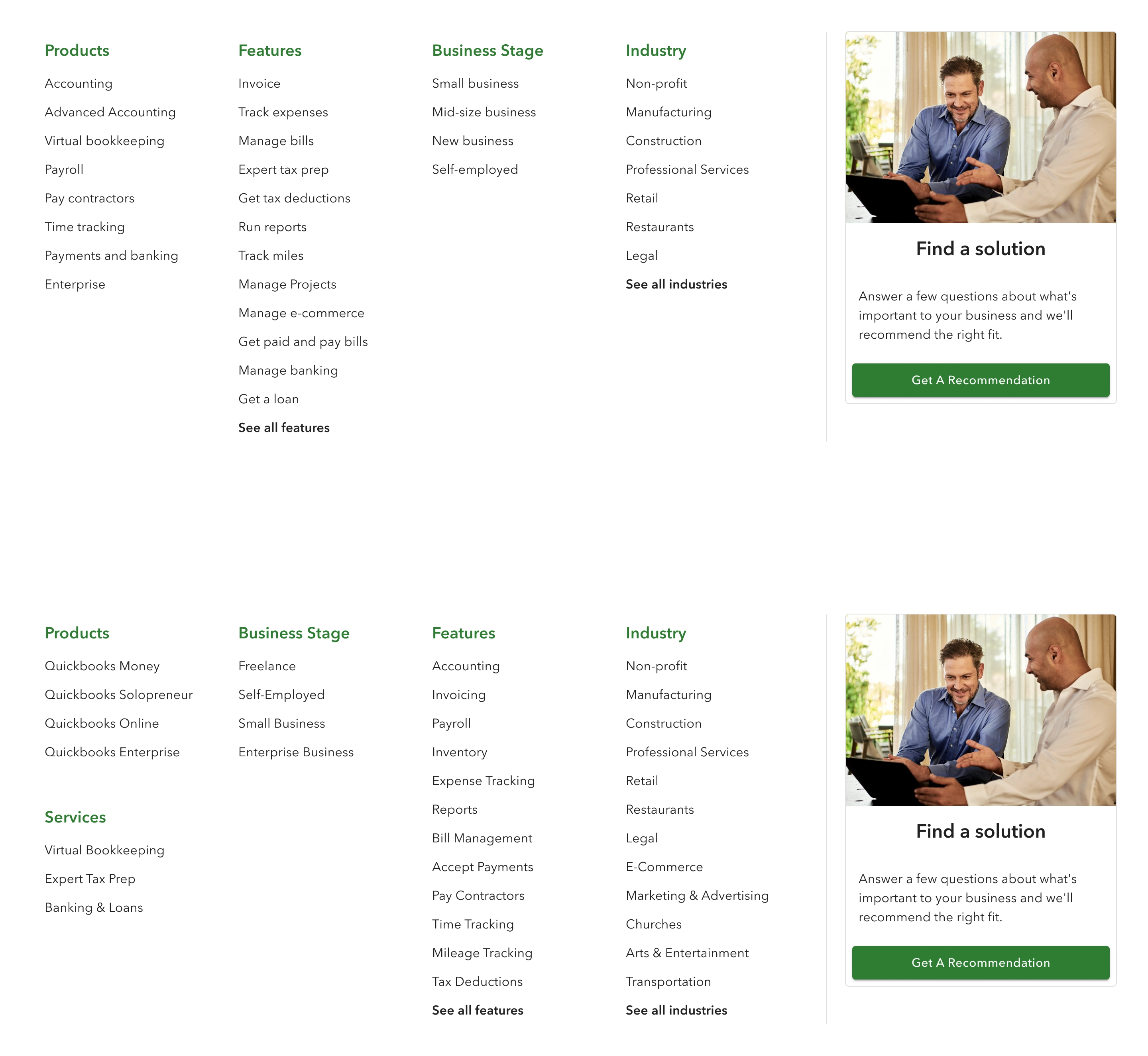
Confusingly in the products section of the main dropdown menu, Quickbooks does not list their products by name but potential business use-cases and features; Accounting, Advanced Accounting, Virtual Bookkeeping, Payroll, Pay Contractors, Time Tracking, Payments and banking and Enterprise. Under the Business stage section, is a list of business stages that 1. do not properly categories their products 2. do not have any hiearchy of business stage or size, listing small business and mid-sized business before new business and self-employed.
Logically grouping products by their name under Products, business stage under Business Stage, and features under Features improves customer product recognition and improve accurate product selection for each customer's use-case.

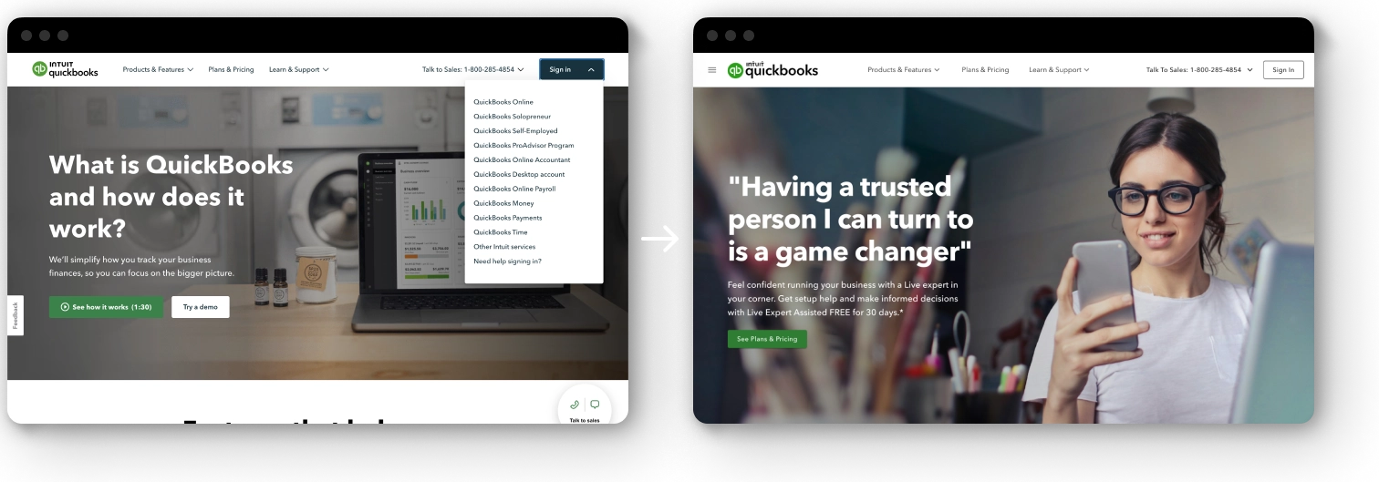
Sign in Menu
When signing in users are prompted to choose which product subscription they would like to navigate to. Because Quickbooks product suite shares a login system, we do not require a dropdown menu for the Sign in button. This avoids users from thinking they need to sign in to each specific product.

